
Net Zero Science and Technology Policy Deployment
Commissioned by:
Science & Technology Policy Research and Information Center (STPI)
Year:
2024
This project presents the visual identity and communication materials for Taiwan’s Net-Zero Science and Technology Policy initiative. The design takes inspiration from the T Stone logo, extracting its leaf element and arranging it into a circular composition. Each leaf represents one of the five thematic areas—Sustainable and Future Energy, Low Carbon, Negative Carbon, Circular Economy, and Humanities & Social Sciences—symbolizing their interconnection and shared mission toward achieving net-zero emissions.
The visual system extends across bilingual book, DM, folders, exhibition graphics, and business cards. Color palettes are drawn from the thematic areas, creating a unified and vibrant look. The result is a cohesive identity that communicates scientific innovation, policy clarity, and the collaborative spirit required for a sustainable future.
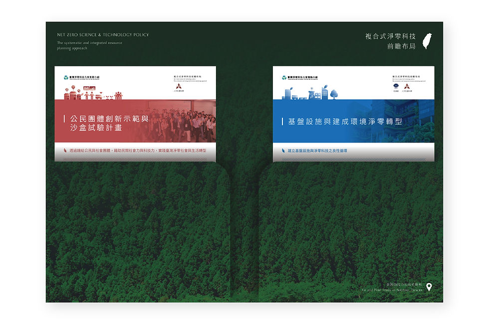
Book Cover Design

The book cover design follows the main visual identity, featuring the circular leaf motif with thematic colors. The gradient tones transition smoothly between the five theme colors, symbolizing interconnection and unity. The minimal yet dynamic layout highlights the title while ensuring a professional and clean appearance.
The inside page design uses a clear grid system for structured content presentation. Color accents drawn from the five thematic palettes guide readers through sections, while ample white space ensures readability. Graphs and images are integrated seamlessly, balancing visual appeal with informative clarity.
DM Design and Folder Design
The DM design adopts the core leaf motif, paired with imagery representing the five thematic areas. Each leaflet uses its own representative color, making it easy to identify key topics while maintaining brand unity. The clean layout and clear typography ensure accessibility for both professional and public audiences.
The folder design integrates the leaf elements into a flowing, circular composition, symbolizing continuity and collaboration. The exterior features thematic colors and imagery, while the interior incorporates rich green textures, reinforcing the environmental focus of the initiative.
A set of five icons was created to represent the project’s core thematic areas: Sustainable and Future Energy, Negative Carbon, Circular Economy, Low Carbon, and Humanities and Social Sciences. Each icon is simplified into a clear, recognizable symbol, ensuring legibility across different sizes and applications.
The color plan assigns a distinct hue to each theme—warm yellow, deep green, vibrant blue, teal, and muted red—ensuring visual differentiation while harmonizing within the overall brand palette. These colors are consistently applied across all communication materials, creating an intuitive connection between visual identity and thematic content.
Business Card Design

The business card design applies the leaf motif and gradient color scheme in a minimal layout. The clean, modern style communicates professionalism while maintaining visual consistency with the broader identity system.
